checkerboard tile ideas Let’s be honest for a second. You’ve been scrolling through Pinterest or Instagram for hours, haven’t you? Your thumb is getting tired, your eyes are glazing over, and you’re seeing the same beige “sad beige” interiors over and over again. You want something with personality. You want a home that feels like you.
Well, freeze that thumb right there.
You’ve landed on the ultimate guide to the design trend that refuses to die and for good reason. We are talking about the checkerboard tile. But before you roll your eyes and think, “Wait, isn’t that just for 1950s diners or Alice in Wonderland?” let me stop you.
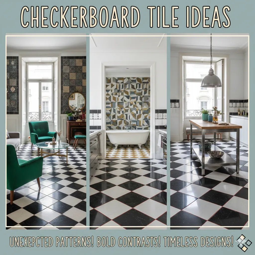
The checkerboard floors of 2025 are not your grandmother’s kitchen linoleum. They are moody, they are textural, and they are arguably the most versatile design element you can introduce to your home. Whether you are looking to inject some Parisian café vibes into your kitchen or create a spa-like sanctuary in your bathroom, the grid is good.
In this deep dive, we’re going to explore why this pattern works, how to choose the right materials (without breaking the bank), and look at color combinations that will absolutely blow your mind.
Ready to play the game? Let’s make a move.
Why the Classic Checkerboard is Having a Major Renaissance
You might be asking, “Why now? Why is everyone obsessed with squares?”
The resurgence of the checkerboard pattern is part of a larger shift in interior design away from the sterile, all-white minimalist look that dominated the 2010s. We are collectively craving nostalgia, comfort, and character.
It’s Not Just for 1950s Diners Anymore
While the black-and-white high-contrast look is iconic, the modern iteration is softer and more organic. Designers are using honed stones, uneven edges, and muted colors to take the “starkness” out of the pattern.
Think of it like a classic white button-down shirt. You can wear it stiff and starched with a suit (classic luxury), or you can wear it unbuttoned and rolled up at the beach (relaxed organic). Checkerboard tile is the button-down shirt of the flooring world.
The Psychology of Pattern: Why Our Brains Love Symmetry
There is actual science behind why we stop scrolling when we see a checkerboard floor. The human brain loves order. The repetitive nature of the grid provides a sense of stability and structure. However, because it relies on contrast, it also stimulates the eye. It is the perfect balance of “calm” and “exciting.”
Did You Know? According to recent design psychology studies, geometric patterns in flooring can actually make a room feel larger by drawing the eye outward to the corners of the room.
Breaking the Mold: Color Combinations That Shock and Awe
If you take only one thing away from this article, let it be this: You do not have to use black and white.
In fact, some of the most stunning “next-level” designs utilize colors you wouldn’t expect. Let’s break down the palettes that are trending right now.
The Soft Minimalist: Beige and Cream
This is for the person who loves the idea of a pattern but is afraid of it shouting at them. Pairing a warm travertine stone with a creamy limestone creates a subtle, tonal texture. It’s a whisper, not a scream. It adds warmth to a kitchen without darkening the space.
The Moody Drama: Midnight Blue and Charcoal
Want to make a powder room feel like a boutique hotel? Forget white. Go dark on dark. A deep navy blue tile paired with a charcoal grey or a slate black creates an incredibly sophisticated, moody vibe. It feels expensive, intimate, and very modern.
The Vibrant Pop: Terracotta and Sage Green
This is a massive trend for cottages, farmhouses, and eclectic homes. The rusty warmth of terracotta paired with a cool, earthy sage green brings the outdoors in. It feels historic and lived-in from day one.
The “New” Classic: Marble and Wood?
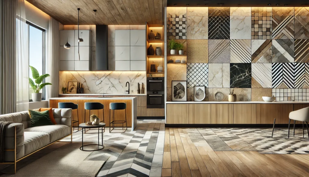
Yes, you read that right. We are seeing innovative floors where stone tiles are inlaid with wood squares. It’s technically difficult to install, but the result is a textural masterpiece that bridges the gap between cold stone and warm timber.

Material Matters: Choosing the Right Tile for Your Vibe
The “look” is only half the battle. You need a material that fits your lifestyle. If you have three dogs and a toddler, your needs are different from a single bachelor in a high-rise.
Here is a breakdown of materials to help you decide.
1. Ceramic vs. Porcelain: The Durable Debate
- Ceramic: Generally softer and easier to cut. Great for walls and low-traffic areas. It’s usually more affordable but can chip if you drop a cast-iron skillet on it.
- Porcelain: The heavyweight champion. It is fired at higher temperatures, making it denser and water-resistant. If you are tiling a mudroom or a main hallway, go porcelain.
2. Marble and Stone: Luxury Underfoot
Nothing beats the real thing. Carrara and Nero Marquina are the classic combo.
- Pros: Each tile is unique; feels cool to the touch; increases home value.
- Cons: It stains. If you spill red wine on unsealed marble, that checkerboard will have a permanent souvenir. It requires maintenance (sealing) every year.
3. Vinyl and Linoleum: The Budget-Friendly Hack
Do not turn your nose up at vinyl! Luxury Vinyl Tile (LVT) has come a long way. You can get peel-and-stick tiles that look surprisingly realistic.
- Best For: Renters, quick DIY weekend projects, and basements.
- Cost: Fraction of the price of stone.
For a massive selection of these materials and detailed reviews on specific brands, I highly recommend checking out TilesBlog. They have excellent deep dives into the specific wear-ratings of different materials which can save you a headache later.
Layout Lowdown: Straight Lay vs. Diagonal (The Harlequin)
The angle at which you lay your tile changes the entire personality of the room.
The Straight Lay (90 Degrees)
This is the grid. It feels stable, historic, and very structured.
- Use this if: You want a classic Victorian or Colonial look, or if you are doing a very modern, graphic space.
The Diagonal Lay (45 Degrees)
Often called a “Harlequin” pattern.
- Use this if: You have a narrow room (like a hallway or galley kitchen). The diagonal lines trick the eye into thinking the floor is wider than it is. It also feels a bit more whimsical and “French Country.”
Pro Tip: If your walls aren’t perfectly square (and in older homes, they never are), a diagonal lay is more forgiving. A straight lay will highlight crooked walls instantly.
Room-by-Room Inspiration Guide
Where should you put these tiles? Everywhere. But here is how to tailor it to specific zones.
The Kitchen: From Backsplashes to Floors
If you do a checkerboard floor, keep the cabinets simple. Let the floor be the hero. Alternatively, keep the floor wood and do a mini-checkerboard backsplash behind the stove. It’s a focal point that packs a punch.
The Bathroom: Powder Room Punch
Powder rooms are small, which means you can afford better materials. This is the place to splurge on that high-end marble checkerboard. Because the room is small, the busy pattern won’t feel overwhelming it will feel like a jewel box.
The Entryway: Making a First Impression
Your foyer sets the tone for the house. A large-format black and white marble floor here says, “I am elegant, and I have my life together.” It’s durable for muddy boots and hides dirt surprisingly well (especially if you choose a grey/black combo).
Outdoor Spaces: Patios with Personality
Why stop at the back door? Painting a concrete patio in a checkerboard pattern using patio paint is a massive trend. It defines the dining zone without needing a rug.
Internal & External Linking Strategy for Success
To truly understand the scope of what is possible, you need to look at . They showcase how this pattern has traveled from ancient Roman temples to modern lofts.
If you are unsure about the difference between floor-rated and wall-rated tiles, check out our guide on Tilesblog. You don’t want to install a wall tile on the floor and have it crack under your weight!
DIY vs. Pro: Can You Handle the Checkers?
This is the million-dollar question. Can you do this yourself?
The DIY Reality Check
Laying tile is hard work on your knees and back. Laying checkerboard tile adds a layer of complexity because alignment is everything.
- Skill Level: Intermediate to Advanced.
- The Risk: If your first row is crooked, the whole room will look like a funhouse.
When to Call a Pro
- If the subfloor is uneven.
- If you are using expensive natural stone (mistakes are costly).
- If the room has complex angles or curved walls.
If you are determined to DIY, start with a small space like a laundry room or a pantry.
Installation Tips to Avoid a Crooked Disaster
If you are going the DIY route, or just want to supervise your contractor intelligently, here is your cheat sheet.
The “Dry Lay” is Non-Negotiable
Before you mix a drop of mortar, lay out your tiles on the floor dry. Figure out where your cuts will be. You do not want to end up with a sliver of white tile on one side and a full black tile on the other. It will look unbalanced.
Use Spacers… Relentlessly
Do not eyeball it. Even a millimeter of drift will be noticeable after ten rows. Use high-quality leveling spacers to ensure the tiles are flat and evenly spaced.
The Color of Grout Changes Everything
- White Grout: Makes the white tiles blend in and the dark tiles pop. High maintenance (gets dirty).
- Dark Grout: Frames the white tiles. Hides dirt well. Adds a graphic outline.
- Grey Grout: The neutralizer. Usually the best choice for longevity and aesthetics.
Maintenance 101: Keeping Your Contrast Sharp
You’ve got the stunning floor. Now, how do you keep it from looking dingy?
- Seal Natural Stone: If you chose marble or limestone, you must seal it immediately upon installation and reseal it annually.
- pH Neutral Cleaners: Acidic cleaners (vinegar, lemon) will etch marble and dull the shine of ceramic glaze over time. Stick to pH-neutral soaps.
- Grout Pens: If you went with white grout and it’s turning yellow, a grout pen is a $10 miracle worker that paints over the discoloration.
Cost Breakdown: What to Expect
Let’s talk numbers. This is an estimate based on 2024/2025 market rates, but it varies by region.
| Material | Material Cost (per sq. ft.) | Installation Cost (per sq. ft.) | Durability |
|---|---|---|---|
| Ceramic | $2 – $8 | $5 – $10 | Medium |
| Porcelain | $4 – $12 | $6 – $12 | High |
| Marble | $10 – $50+ | $10 – $20 | Medium (High Maintenance) |
| Peel & Stick Vinyl | $1 – $4 | $0 (DIY) | Low to Medium |
| Painted Concrete | $50 (Total for paint) | $0 (DIY) | Medium |
Data Source: Averages compiled from national home improvement databases and contractor surveys.
Styling Your Space Around Bold Floors
A common fear is, “If I do this floor, will it clash with my furniture?”
The checkerboard is a “neutral pattern.” It plays surprisingly well with others.
- Mix with Wood: Warm wood tones soften the graphic nature of the check.
- Mix with Florals: Yes! The geometric grid grounds the chaos of a floral wallpaper. It’s a very English Country House look.
- Keep Rugs Simple: If the floor is busy, choose a solid color jute or wool rug to give the eye a place to rest.
Case Study: A Laundry Room Transformation
Let’s look at a real-world example.
The Problem: Sarah, a homeowner in Ohio, had a laundry room with peeling beige linoleum from 1998. It was dark, depressing, and she hated doing laundry there.
The Solution: She chose a slate blue and chalk white ceramic tile in a diagonal run.
The Process:
- Removed old linoleum.
- Leveled the subfloor (critical step!).
- Installed 12×12 tiles.
- Painted the cabinets a soft greige to complement the floor.
The Result: The diagonal lines made the narrow room look 30% wider. The blue hid the lint and dirt better than the old beige.
ROI: Sarah spent roughly $800 on materials. A local realtor estimated the update added about $2,500 in perceived value to the home because it turned a “utility” space into a “feature” space.
Advanced Tip: The “Scale” Game
Most people default to 12×12 inch tiles. But if you want that “Next-Level” look, play with scale.
- Go Micro: Small mosaic 1×1 inch checkerboards are amazing for shower floors or backsplashes.
- Go Macro: Large format 24×24 inch tiles in a large kitchen feel incredibly luxurious and modern. They also mean fewer grout lines to clean!
Conclusion: Checkerboard tile ideas Ready to Make Your Move?
So, are you ready to stop scrolling and start tiling?
Checkerboard flooring is more than just a trend; it is a design staple that has survived centuries for a reason. It is bold, it is beautiful, and it is unapologetically stylish. Whether you choose a classic black and white marble for your entryway or a funky terracotta and sage for your kitchen, you are making a statement that you care about your home.
Don’t let the fear of “bold” keep you in the land of “boring.” Your home should make you smile when you walk in the door.
Call to Action:
Have you installed checkerboard tile in your home? Or are you stuck deciding between navy or black? Drop a comment below! We’d love to hear about your projects. And if you are still hunting for that perfect tile, don’t forget to browse the curated collections at TilesBlog for endless inspiration.
Frequently Asked Questions (FAQs)
Q1: Will checkerboard floors make my small kitchen look smaller?
Answer: Generally, no! In fact, if you lay the tiles diagonally (diamond pattern), it draws the eye to the widest points of the room, creating an optical illusion of more space. Large format tiles (like 18×18) can also expand a small room visually by reducing visual clutter from grout lines.
Q2: Is checkerboard tile a trend that will fade by 2026?
Answer: While it is trending hard right now, checkerboard is considered a “classic.” It has been around since Victorian times (and Roman times before that!). If you stick to neutral colors or natural stones, it is timeless. High-contrast neon colors might date faster, but classic combos are forever.
Q3: Can I paint my existing tile to look like a checkerboard?
Answer: Yes! This is a great budget-friendly interim solution. You will need a high-quality bonding primer and specific porch/floor paint. Use a stencil or painter’s tape. However, be aware that painted tile in high-traffic areas will eventually chip and need touch-ups.
Q4: What is the best grout color for black and white tile?
Answer: A medium grey (like a “silverado” or “delorean grey”) is usually the smartest choice. White grout will eventually turn grey/brown from dirt in the high traffic areas, making the floor look unevenly dirty. Grey starts dark and stays consistent.
Q5: Does checkerboard work with modern farmhouse style?
Answer: Absolutely. To keep it “farmhouse” and not “retro diner,” opt for softer materials. Instead of glossy black and white ceramic, try a matte charcoal and creamy white stone, or a buffalo check pattern using grey and white. It adds that rustic charm perfectly.
Disclaimer: This article provides design inspiration and general advice. Always consult with a professional contractor for installation to ensure your specific subfloor and structural needs are met.


