This Simple Tiles Work Hack Can Make Your Home Look 2X More Expensive
The Secret That Interior Designers Don’t Want You to Know
Ever walked into a home and immediately thought, “Wow, this place is expensive,” only to discover later that the homeowner didn’t spend a fortune on the renovation? We’ve all been there. The secret often isn’t what the designers are showing off it’s what they’re doing behind the scenes with something most people overlook entirely: tiles and how they’re finished.
Here’s the truth that might surprise you: the difference between a bathroom that screams “bargain basement” and one that whispers “luxury penthouse” often comes down to a single element that costs less than you’d think. We’re talking about the grout, the tile format, and how these elements work together to create an illusion of premium finishes and expensive craftsmanship.
According to recent home renovation data, 37% of homeowners prioritize bathroom remodels as their top renovation project, yet many spend thousands on quality tiles only to undermine the entire design with one crucial mistake. The good news? This article reveals exactly what that mistake is and how to avoid it.
The Tile Dilemma: Why Most Homes Don’t Look Expensive
Common Tile Mistakes That Scream “Budget”
Let’s be honest not every tiled bathroom or kitchen looks upscale. In fact, there are several telltale signs that your tiles, no matter how nice they are, might be making your entire space feel bargain-basement rather than five-star hotel.
Mistake #1: Choosing Glossy, High-Shine Finishes
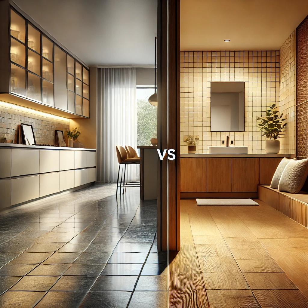
Here’s something interior designers know but won’t tell everyone: super glossy, shiny tiles actually make spaces look cheaper and more dated. Why? Because overly shiny surfaces create harsh reflections that emphasize imperfections and give that “plastic-looking” artificial feel rather than refined, high-end elegance. Think about luxury hotels their tiles typically have a matte or soft satin finish, not that mirror-like shine that screams “chain hotel bathroom.”
Mistake #2: Using Small Tiles with Excessive Grout Lines
When you cover a wall with dozens of tiny tiles, something psychologically happens: your eye fixates on all those grout lines, and suddenly the space feels busy, fragmented, and modest. Large-format tiles, on the other hand, create that seamless, clean look that’s synonymous with modern luxury design. The fewer grout lines you have, the more expansive and elegant your space feels.
Mistake #3: Neglecting Grout Discoloration
This is the professional secret nobody talks about: even the most expensive tiles become worthless when the grout around them turns dingy, stained, or crumbly. Grout degradation is one of the quickest ways to make premium tiles look abandoned and tired. Yet most homeowners don’t maintain their grout properly.
Mistake #4: Mismatching Floor and Wall Tiles
Luxury design is about cohesion and flow. When you mix tile colors, finishes, and materials haphazardly between floors and walls, the entire space loses its professional polish. High-end homes have a unified vision where tiles complement each other.

The Game-Changing Tile Hack That Doubles Home Value Perception
Why This Simple Strategy Works Better Than Expensive Renovations
Here’s the hack that changes everything: the right grout color choice combined with large-format tiles can transform even budget-friendly ceramic tiles into a luxury-looking installation that makes your entire home feel more expensive.
Think of it this way—your tiles are the canvas, but the grout is the frame. A beautiful painting in a cheap, mismatched frame looks less impressive. But that same painting in the right frame? It becomes a centerpiece.
The numbers back this up. While bathroom remodels cost an average of $15,000 to $35,000, the grout color choice costs virtually nothing—yet it’s often the difference between a 50% and 70% return on investment when you eventually sell your home. According to renovation experts, bathroom remodels deliver a 67-72% ROI for mid-range updates, but many homeowners waste this potential by missing simple finishing touches.
The hack works on three fundamental principles:
Principle #1: Fewer Grout Lines = Perceived Luxury
Large-format tiles reduce the number of visible grout lines, creating visual continuity that the human eye interprets as more expensive and spacious.
Principle #2: Strategic Grout Color Creates Definition
The right grout color doesn’t just hold tiles together—it frames them in a way that either elevates or diminishes their perceived value. A contrasting dark grout on light tiles creates dramatic definition, while matching grout creates a seamless, sophisticated look.
Principle #3: Matte Finishes = Premium Quality
Matte and textured tiles reflect luxury, while glossy finishes read as budget-friendly or dated. This psychological association is so strong that even modest tile materials look expensive with the right finish.
Why Grout Color Matters More Than You Think
Let’s dive deeper into why grout color is the unsung hero of luxury tile design. Most people think of grout as the boring gray stuff that holds tiles in place. But grout color is actually a design element that can make or break your entire aesthetic.
Gray Grout: The Balanced Professional Choice
Gray grout strikes that perfect balance—it’s subtle enough to blend seamlessly, yet distinct enough to define each tile edge. Gray pairs beautifully with nearly every tile color imaginable, from crisp whites and pastels to warm wood tones and cool stone finishes. Light gray creates a subtle, harmonious look that makes spaces feel larger, while darker gray adds more definition and contemporary edge without the boldness of black.
The genius of gray? It’s also incredibly forgiving when it comes to daily wear and dust, making it practical for high-traffic areas like kitchens and bathrooms.
Black Grout: The Bold Statement Maker
When you want drama and visual impact, black grout transforms even ordinary tiles into a focal point. It creates a graphic, contemporary aesthetic that works particularly well with white or light-colored tiles. Black grout is also excellent at hiding everyday stains, making it ideal for busy households. The contrast it creates adds character and depth, turning basic tile installations into design statements.
White or Near-White Grout: The Subtle Elegance
White grout creates that seamless, flowing look that makes spaces feel larger and lighter. However, the trade-off is that white grout requires more maintenance to keep it looking fresh, as it shows dust and stains more readily. This approach works beautifully in minimalist or modern spaces where you want tiles to blend into the background.
Brown or Earthy Grout: The Rustic Warmth
For natural-inspired designs featuring terracotta, stone-look, or wood-effect tiles, brown grout brings warmth and organic charm. It also hides dust and dirt exceptionally well, making it practical for busy spaces while maintaining that high-end, nature-inspired aesthetic.
Step-by-Step Guide to Implementing the Luxury Tile Hack
Choosing the Right Tile Format: Large-Format vs. Traditional Tiles
The Psychology of Tile Size
This is where the magic happens. Tile size profoundly affects how your brain perceives a space. Large-format tiles (typically 24×24 inches or larger) create fewer visual interruptions, allowing your eye to travel smoothly across the surface. This continuity signals luxury and spaciousness to your subconscious. Smaller tiles, conversely, fragment the visual field and make spaces feel busier and more modest.
Why Large-Format Tiles Communicate “Expensive”
Several factors make large tiles communicate luxury:
- Minimal Grout Lines: With fewer grout lines, there are fewer visual “breaks” for your eye to process. This simplicity is associated with high-end design.
- Seamless Appearance: Large tiles create that coveted seamless, clean aesthetic that’s synonymous with modern luxury hotels and premium residential spaces.
- Better for Space Perception: Fewer tiles mean fewer visual obstacles, making even modest-sized bathrooms or kitchens feel more expansive and generous.
- Contemporary Association: Modern luxury design almost universally uses large-format tiles. When people see them, they instantly associate the space with contemporary, upscale design.
The Investment Difference
Yes, large-format tiles typically cost more per tile than traditional smaller sizes. However, you use fewer tiles overall, so the total material cost might be comparable or even lower. Installation, however, requires more care due to the weight and size, which can increase labor costs slightly.
But here’s the thing: the perceived value increase far exceeds the modest additional investment. You’re essentially getting a 2X value perception boost for a 10-15% increase in total installation costs.
The Grout Color Strategy That Changes Everything
Step 1: Choose Your Primary Tile Color and Material
Start by selecting tiles that appeal to you aesthetically and functionally fit your space. This might be classic white subway tiles, marble-effect tiles, wood-look ceramics, or contemporary solid colors.
Step 2: Identify Your Design Intention
Ask yourself: do you want this space to feel cohesive and seamless, or do you want to create visual drama and definition?
- Seamless Look: Match your grout color closely to your tile color. This creates that minimalist, flowing aesthetic that reads as modern and sophisticated.
- Dramatic Look: Choose contrasting grout colors to outline each tile and create visual interest. Light tiles with dark grout create the boldest contrast and contemporary feel.
Step 3: Test Before Committing
This is crucial and something professionals always do: get samples and test grout colors in your actual space under your actual lighting conditions. A grout color that looks perfect in the store might look completely different in your bathroom’s natural light or under your specific lighting fixtures. Order samples of at least 2-3 grout color options and install small test patches.
Step 4: Maintain from Day One
The best grout color in the world will look terrible if it’s not maintained properly. Once your tiles are installed:
- Use pH-neutral, acid-free cleaners appropriate for your tile material
- Avoid acidic cleaners that can scratch and damage tiles
- Wipe up spills and moisture regularly
- For cement or natural stone tiles, use specialized cleaners recommended for those materials
- For ceramic or porcelain, a mixture of warm water and mild dish soap works perfectly
This simple maintenance routine keeps your luxury-look tiles looking premium for years.
Real-World Examples: Before & After Transformations
Kitchen Transformation: Budget Tiles, Luxury Hack
The Situation: A homeowner in Nashville had a kitchen with basic ceramic tiles that felt dated and uninspired. Budget constraints meant replacing all the tiles wasn’t an option.
The Solution: Instead of replacing the tiles, they invested in re-grouting with a sleek dark gray color and replaced the backsplash with large-format marble-effect tiles. The kitchen instantly transformed. The small floor tiles now felt intentional and classic rather than cheap, and the dramatic backsplash became the focal point that elevated the entire space.
The Result: The kitchen went from feeling like a 1990s remnant to looking thoughtfully designed. Professional appraisers noted the upgraded appearance when they valued the home for refinancing.
Bathroom Makeover: The Power of Finish Choice
The Situation: A homeowner had selected expensive marble-look tiles for a bathroom remodel but chose glossy finishes without considering how they’d actually look. The bathroom felt plastic-like and artificial despite the high-quality materials.
The Solution: They worked with their designer to choose matte-finish tiles with the same marble look and selected a soft gray grout instead of white. The installation emphasized larger tiles on walls to minimize grout lines.
The Result: The same material investment suddenly looked twice as luxurious. The matte finish eliminated harsh reflections, the gray grout provided subtle definition without being jarring, and the larger tile format created visual flow. The bathroom finally matched the quality of the materials.
Living Space Upgrade: Transforming a Dated Tile Floor
The Situation: A living room had small mosaic-pattern tiles from the previous decade that constantly made the space feel cramped and busy.
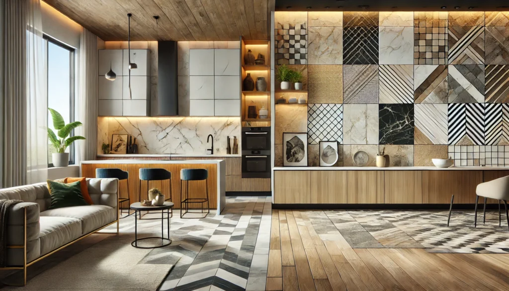
The Solution: Rather than complete replacement, the homeowner strategically added large-format wood-look tiles in a living room extension, creating a visual contrast that made the older tiles feel like a deliberate design choice. They also updated lighting fixtures to warmer tones that made all tiles look more refined.
The Result: The mixed tile strategy suddenly appeared intentional and designed rather than mismatched. The warmer lighting eliminated harsh reflections that had made everything look cheap.
Advanced Tile Installation Hacks for Maximum Impact
Grout Application Techniques Professionals Use
Professional tile installers know that the quality of grout application is just as important as the grout color choice itself. Here’s what separates premium installations from budget jobs:
Proper Joint Width: Standard grout joints should be 1/8 inch to 1/4 inch wide. Consistent joint width across the entire installation makes even modest tiles look intentional and professional. Inconsistent joints immediately signal amateur work.
Clean Grout Lines: The grout should be flush with the tile surface or slightly recessed, but never heaping above or below the tiles. Lumpy, uneven grout application makes expensive tiles look poorly installed.
Sealing for Longevity: After grouting, professional installers seal the grout to protect it from staining and moisture. This simple step dramatically extends the life of your grout and maintains that luxury appearance.
Maintenance Secrets Professionals Use to Keep Tiles Looking Premium
The Weekly Routine:
- Wipe down tiles daily with a soft, damp cloth
- Address spills immediately to prevent staining, especially on lighter grout colors
- Avoid standing water in bathrooms; squeegee shower walls to prevent moisture accumulation
The Monthly Deep Clean:
- Use pH-neutral cleaner appropriate for your tile material
- For stubborn grime, a soft brush works better than abrasive scrubbing pads
- Never use bleach on porous tiles like natural stone or cement
The Annual Refresh:
- Consider re-sealing grout to restore protection and appearance
- For tiles looking tired, professional cleaning with specialized products can restore shine and color
- Replace any damaged tiles immediately—one damaged tile undermines the entire design
The Professional Secret Nobody Talks About: Lighting dramatically affects how tiles look. Soft, warm-toned lighting creates a more luxurious atmosphere and hides minor imperfections. Harsh, cool-toned lighting emphasizes every flaw. If your tiles look cheap, you might just need to upgrade your bathroom or kitchen lighting to warm LED fixtures or install dimmable options.
Frequently Asked Questions About Luxury Tile Design
FAQ 1: Can I make cheap tiles look expensive with grout color alone?
The Answer: To a significant degree, yes. The right grout color can absolutely elevate the appearance of even budget ceramic tiles. However, the true magic happens when you combine grout color with tile format. Large-format tiles with the right grout color will always look more expensive than small tiles with perfect grout, simply because of how human perception works. That said, if you’re stuck with small tiles, strategic grout color choice (like a matching, seamless look) can minimize the “budget” feel.
FAQ 2: What’s the best grout color for small bathrooms?
The Answer: Light gray or white grout is traditionally recommended for small bathrooms because the minimal contrast helps spaces feel larger and more open. However, modern design has proven that bold contrasts (like black grout with white tiles) can also work beautifully if used strategically. The key is testing samples in your actual space before committing. Personal preference matters more than rules—if you love dark grout and it looks good to your eye, go for it.
FAQ 3: How much does re-grouting cost compared to tile replacement?
The Answer: Re-grouting typically costs 50-70% less than full tile replacement, making it an incredibly cost-effective way to refresh a dated appearance. While professional re-grouting can cost $500-$2,000 depending on the size of your space, it delivers similar visual impact to replacing the tiles themselves, which would cost $5,000-$15,000 or more.
FAQ 4: Will matte tiles show more dirt and stains than glossy tiles?
The Answer: Interestingly, no. While matte finishes are less reflective, they actually hide dust and minor stains better than glossy tiles because there are no harsh reflections highlighting every imperfection. The matte surface distributes light more evenly, creating a cleaner overall appearance. Regular maintenance is more important than finish type when it comes to keeping tiles looking fresh.
FAQ 5: Is it worth upgrading to large-format tiles if I have uneven floors?
The Answer: This is one situation where large-format tiles require extra consideration. They need nearly perfect substrate preparation—ideally within 1/8 inch variation over 10 feet. If your floor has significant unevenness, a professional installer can use self-leveling compounds to prepare the surface, but this adds cost. In some cases, sticking with medium-sized tiles or addressing the subfloor unevenness first might be more practical. Always have a professional assess your space before committing to large-format tiles.
Transform Your Home Without the Luxury Price Tag
The Bottom Line: Your Tiles Don’t Need to Be Expensive to Look Expensive
Here’s what we’ve learned: the difference between a bathroom that feels luxurious and one that feels budget-conscious has surprisingly little to do with the actual cost of materials. It’s about understanding the psychology of design, making strategic choices with grout color and tile format, and maintaining what you’ve installed.
Bathroom remodels deliver an average 67% ROI for mid-range updates, but that ROI only materializes if the final result actually looks premium. A $3,000 tile installation that looks expensive delivers far more perceived value than a $10,000 installation with poor finishing choices.
The hack is simple: choose large-format tiles, select strategic grout color based on your design intention, ensure proper installation and maintenance, and upgrade your lighting to warm tones. This combination costs marginally more than standard approaches but delivers the appearance of a luxury installation.
You don’t need to be an interior designer or spend five figures to make your home look expensive. You just need to understand what actually communicates luxury—and that understanding starts with tiles.
For more expert insights on tile selection, design trends, and home improvement hacks, visit Tiles Blog, where professionals share their best-kept design secrets daily.


